YouTube Thumbnail Design Tips for Beginners
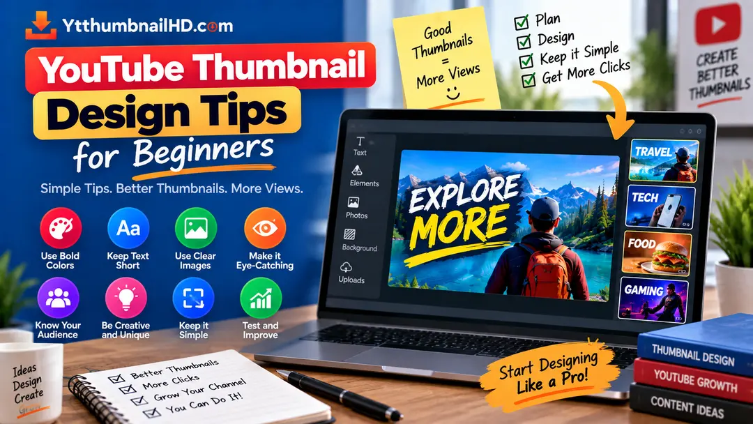
Designing a YouTube thumbnail can seem difficult when you are just getting started. There are colors, images, text, fonts, backgrounds, and many other elements to consider.
The good news is that you do not need advanced graphic design skills to create a clear and useful thumbnail. A few basic design principles can make a significant difference in how easily viewers understand your visual.
Do not try to put everything from your video into one thumbnail. Start with one clear subject, one main idea, and a simple visual hierarchy.
1. Keep the Design Simple
One of the most common mistakes beginners make is trying to add too many things to a thumbnail.
Multiple photos, several text blocks, logos, arrows, icons, effects, backgrounds, and other elements can make the image difficult to understand.
A simpler composition gives viewers a better chance of understanding the main idea quickly.
A simple thumbnail can still have strong contrast, interesting imagery, personality, and visual impact. The goal is to remove unnecessary elements rather than remove all creativity.
2. Use One Main Subject
Give your thumbnail a clear focal point.
The main subject might be a person, product, object, location, screenshot, or another visual that represents the video's main idea.
If everything in the image has the same visual importance, nothing stands out. Make the primary subject more noticeable than supporting elements.
Main Subject
The element viewers should notice first.
Supporting Elements
Smaller elements that provide context without competing with the main subject.
Background
Provides visual context while remaining secondary to the main subject.
3. Create a Clear Visual Hierarchy
Visual hierarchy means deciding which elements viewers should notice first, second, and third.
You can create hierarchy through size, position, contrast, spacing, and other visual differences.
For example, a large subject can attract attention first, a short text message can provide context second, and smaller supporting details can be noticed afterward.
Primary Focus
Make the most important visual element immediately noticeable.
Supporting Message
Use text or another visual element to add useful context.
Secondary Details
Keep additional information visually less dominant.
4. Use Contrast Carefully
Contrast helps separate important elements from their surroundings.
You can create contrast using differences in light and dark areas, colors, size, or other visual properties. The important thing is that the contrast should support readability and focus.
For example, dark text on a busy dark background may be difficult to read. A lighter area behind the text or a stronger separation between foreground and background can make the message clearer.
Contrast should make important elements easier to see, not make the entire thumbnail visually overwhelming.
5. Keep Text Short and Readable
If you decide to use text, keep it focused on the most useful part of the message.
A thumbnail is not the place to write a complete explanation. Viewers should be able to understand the message without reading a large paragraph.
- Use a short message.
- Avoid unnecessary words.
- Make important words visually noticeable.
- Keep sufficient separation between text and other elements.
- Check that the text remains readable at a small size.
6. Choose Fonts That Are Easy to Read
Beginners often experiment with decorative fonts because they look interesting when viewed at full size. However, a complicated font can become difficult to read when the thumbnail is displayed smaller.
Start with a font that has clear letter shapes and good readability. You can create emphasis using font weight, size, or a simple combination of type styles.
Try not to use several unrelated fonts in the same thumbnail. A small, consistent type system usually makes the design easier to understand.
7. Leave Enough Empty Space
Empty space is not wasted space. It can help separate important elements and make a thumbnail easier to read.
When every part of the canvas is filled with an image, text, shapes, and effects, the design can feel crowded.
Give your main subject and text enough room to breathe. This also helps prevent important elements from becoming difficult to distinguish.
Temporarily remove one or two decorative elements. If the thumbnail becomes clearer without them, they probably were not necessary.
8. Choose a Background That Supports the Subject
The background should help the main subject stand out, not compete with it.
A detailed photograph can sometimes work well as a background, but if it contains too many high-contrast details, it may make text and subjects harder to see.
You can simplify a background by reducing unnecessary details, using a softer area behind text, or creating stronger separation between foreground and background.
Helpful Background
Provides context and supports the main subject without taking attention away from it.
Distracting Background
Contains so many competing details that the main subject or message becomes difficult to identify.
9. Check the Thumbnail at a Small Size
A thumbnail may look excellent while you are designing it at full resolution but become difficult to understand when displayed much smaller.
Before finalizing the design, reduce the image and check whether the main subject and message are still clear.
Pay particular attention to small text, thin details, low-contrast elements, and objects that become difficult to recognize after scaling down.
If you can still identify the main subject and understand the basic idea after reducing the thumbnail significantly, the design is much easier to use in real viewing situations.
10. Build a Consistent Visual Style
If you publish videos regularly, you do not necessarily need to create a completely different visual style for every upload.
A consistent approach to typography, spacing, composition, or visual treatment can help your content develop a recognizable identity.
Consistency does not mean making every thumbnail identical. Your thumbnail should still reflect the individual video's topic and story.
11. Common Beginner Design Mistakes
Learning what to avoid can be just as useful as learning what to add.
Too Much Text
Large blocks of text can make the thumbnail difficult to scan quickly.
Too Many Elements
Too many images, icons, effects, and shapes can create visual clutter.
Weak Contrast
Text and important subjects can disappear into the background when there is not enough separation.
No Clear Focus
When every element competes for attention, viewers may struggle to identify the main idea.
Unreadable Fonts
Decorative or very thin fonts may become difficult to read at smaller sizes.
Unnecessary Effects
Shadows, glows, outlines, and other effects should support the design rather than become the design.
12. Beginner Thumbnail Checklist
Before uploading your finished thumbnail, quickly review these points.
- The thumbnail has one clear main idea.
- The main subject is easy to identify.
- Important elements have enough contrast.
- Text is short and readable.
- The background does not overpower the subject.
- There is enough empty space around important elements.
- The design is still understandable at a small size.
- The visual accurately represents the video.
- Unnecessary effects and decorative elements have been removed.
Which Design Tool Should a Beginner Use?
The best design tool is usually the one you can use comfortably and consistently.
Beginners can start with simple browser-based graphic design tools or image editors rather than immediately learning professional design software.
Focus first on understanding composition, hierarchy, contrast, spacing, and readability. The software becomes much easier to learn once you understand why you are making a particular design decision.
Don't Forget the Technical Size
Good design also needs the correct image dimensions. YouTube currently recommends a 16:9 custom thumbnail with a recommended resolution of 3840 × 2160 pixels and a minimum width of 640 pixels for regular videos.
For the complete technical specifications, including dimensions, aspect ratio, formats, and other useful information, see our YouTube thumbnail size guide .
Want to Save a YouTube Thumbnail?
If you need to download a thumbnail from an existing YouTube video, use YTThumbnailHD to extract the available thumbnail image quickly.
Download YouTube ThumbnailFrequently Asked Questions
Start with one clear subject and one main idea. Use readable text when needed, create enough contrast, leave some empty space, and make sure the thumbnail remains understandable at a small size.
There is no fixed word limit, but thumbnail text should be short enough to read quickly. Avoid turning the thumbnail into a paragraph or simply copying the entire video title.
Bright colors can be useful, but they are not required for every thumbnail. Choose colors that create useful contrast and support the video's subject instead of using bright colors simply to make the design louder.
No. Some thumbnails can communicate their idea effectively with imagery alone. Text is useful when it adds context that the visual cannot communicate clearly by itself.
Keep the main idea clear. A thumbnail should not require viewers to study every element before they understand what it represents.