Common YouTube Thumbnail Mistakes That Can Hurt Your Views
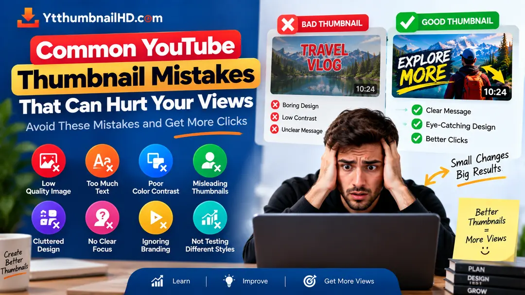
A YouTube thumbnail is one of the first things viewers see when they come across a video. A weak thumbnail can make an otherwise useful video easy to overlook, while a clear and relevant thumbnail can communicate the video's subject much faster.
Many thumbnail problems are not caused by a lack of expensive software or advanced design skills. They are often simple mistakes involving clutter, readability, poor visual focus, misleading imagery, or a mismatch between the thumbnail and the actual video.
The biggest thumbnail mistakes usually make the image harder to understand, less relevant to the video, or difficult to view at a small size. Fixing those problems can make your video packaging clearer and more useful to potential viewers.
1. Putting Too Much Information in One Thumbnail
A thumbnail has limited space, so trying to explain the entire video inside the image can quickly make the design difficult to understand.
Beginners sometimes add multiple messages, long phrases, several screenshots, icons, arrows, and other details because they want viewers to know everything before clicking.
Instead, identify the single most important idea that the thumbnail needs to communicate and build the visual around it.
Let the title, thumbnail, and video description each do their own job. The thumbnail does not need to contain every piece of information about the video.
2. Using Too Many Visual Elements
Another common problem is visual overcrowding.
Adding more objects does not automatically make a thumbnail more interesting. When several subjects have similar size and visual importance, viewers may not know where to look first.
Too Crowded
Many images, effects, labels, icons, and shapes compete for attention.
More Focused
One main subject receives the most attention while supporting elements provide only useful context.
Remove anything that does not contribute to the main message. If removing an element makes the thumbnail clearer, it may not have been necessary.
3. Using Text That Is Too Small
Text that looks readable on a large computer screen may become almost impossible to read when the thumbnail is displayed smaller.
Avoid filling the image with long sentences or several separate text blocks. Use a short message and make sure its size and placement allow it to remain readable.
- Keep the message concise.
- Avoid unnecessary words.
- Give text enough space around it.
- Use sufficient contrast against the background.
- Preview the final thumbnail at a smaller size.
4. Ignoring Contrast
Important elements need enough separation from their surroundings to remain visible.
A subject can disappear into the background when both have similar visual characteristics. Text can have the same problem if its color is too similar to the area behind it.
Contrast does not mean that every thumbnail needs extreme colors. It means that important elements should be distinguishable from the elements around them.
Check the thumbnail in a smaller preview before deciding that the contrast is good enough.
5. Having No Clear Focal Point
Viewers should not have to search the entire thumbnail to discover what the video is about.
If the main person, product, object, or event is too small compared with other elements, the thumbnail can lose its visual focus.
Decide what should be noticed first and give that element enough visual importance.
6. Using a Distracting Background
A detailed background can look impressive by itself but may become a problem when it competes with the main subject.
Busy backgrounds can also make text harder to read, particularly when the background contains many areas of different brightness or detail.
Background That Helps
Adds context while allowing the main subject and message to remain easy to identify.
Background That Hurts Clarity
Competes with the subject and makes text or other important elements difficult to distinguish.
7. Choosing an Image That Does Not Fit the Video
A visually attractive image is not necessarily the right image for a particular video.
The thumbnail should give viewers an accurate visual representation of the video's subject or central idea.
For example, if a video is a review of a particular product, the product should be represented clearly. If the video is about a specific event, the chosen image should relate to that event rather than simply being visually dramatic.
8. Making the Thumbnail Misleading
Trying to attract attention by showing something that does not actually appear in the video can create the wrong expectation.
YouTube advises creators to make thumbnails accurately represent their content and avoid misleading viewers.
Find the most interesting genuine element from the video and make that the focus of the thumbnail. Curiosity works best when the promised subject is actually delivered in the video.
9. Creating a Conflict Between Title and Thumbnail
The title and thumbnail are normally viewed together. If they appear to describe two completely different things, viewers may become confused about what the video actually offers.
They do not have to repeat the same words or show the exact same information. Instead, they should complement each other.
Works Together
The title explains the topic while the thumbnail reinforces the central visual idea.
Creates Confusion
The title suggests one subject while the thumbnail appears to promise something unrelated.
10. Copying Another Creator's Style Too Closely
Looking at successful channels can provide useful inspiration, but copying another creator's thumbnail style too closely can make your own content feel interchangeable.
Instead, study why a particular thumbnail works. Look at its composition, subject placement, readability, and visual hierarchy, then apply those principles to your own content.
Your thumbnail style should develop naturally from your content, audience, and personality.
11. Uploading the Wrong Image Size
A well-designed thumbnail can still create problems if the final image does not follow the appropriate YouTube specifications.
For regular YouTube videos, YouTube currently recommends a 16:9 thumbnail at 3840 × 2160 pixels, with a minimum width of 640 pixels. Supported image formats include JPEG and PNG.
You can find the full technical specifications in our complete YouTube thumbnail size guide .
12. Never Checking the Thumbnail at a Small Size
Designing only at full size can hide problems that become obvious after the image is reduced.
Small text, thin lines, subtle details, and low-contrast elements can disappear when the thumbnail is displayed at a smaller size.
Finish the Design
Complete your main composition and remove unnecessary elements.
Reduce the Preview
View the thumbnail at a significantly smaller size than the original canvas.
Check the Focus
Make sure the main subject and message remain easy to recognize.
Make Adjustments
Increase clarity or remove details that no longer work at the smaller size.
13. Changing Thumbnails Without a Clear Reason
If a video is not performing as expected, it can be tempting to repeatedly replace the thumbnail without first understanding what might be happening.
Thumbnail performance should be considered together with impressions, traffic sources, audience behavior, and other available analytics rather than judging one metric in isolation.
If you decide to change a thumbnail, make a meaningful change based on what you are trying to improve. For eligible creators, YouTube also provides testing tools that can help compare different title and thumbnail combinations.
14. Thumbnail Mistake Checklist
Before publishing, use this quick checklist to catch common problems.
- The thumbnail has one clear main idea.
- The main subject is easy to identify.
- Text is short and readable.
- Important elements have enough contrast.
- The background does not overpower the subject.
- The image accurately represents the video.
- The title and thumbnail make sense together.
- The design does not contain unnecessary clutter.
- The image follows the appropriate technical specifications.
- The thumbnail still works when viewed at a small size.
What Should You Fix First?
You do not need to redesign everything at once. If you notice several problems, start with the issues that most directly affect clarity.
Remove Clutter
Delete elements that do not contribute to the main idea.
Strengthen the Focus
Make the primary subject easier to identify.
Improve Readability
Check text size, spacing, and contrast.
Check Relevance
Make sure the final thumbnail accurately represents the video.
Need to Download a YouTube Thumbnail?
If you want to save a thumbnail from an existing YouTube video, use YTThumbnailHD to extract the available thumbnail image quickly.
Download YouTube ThumbnailFrequently Asked Questions
One common mistake is making the thumbnail too complicated. Too much text, too many visual elements, or a lack of clear focus can make the main idea difficult to understand.
Too much text can make a thumbnail difficult to scan and understand, especially when displayed at a smaller size. Use only the words needed to support the main visual idea.
No. A thumbnail does not need bright colors to work well. The important thing is that the main subject and message are clearly visible and separated from the surrounding elements.
A misleading thumbnail can create the wrong expectation about a video. YouTube advises creators to use thumbnails that accurately represent the content.
Do not judge the thumbnail from views alone. Consider impressions, traffic sources, CTR, audience behavior, and other available analytics before deciding whether a thumbnail change makes sense.