YouTube Thumbnail Best Practices: 15 Tips for Better Click-Through Rate
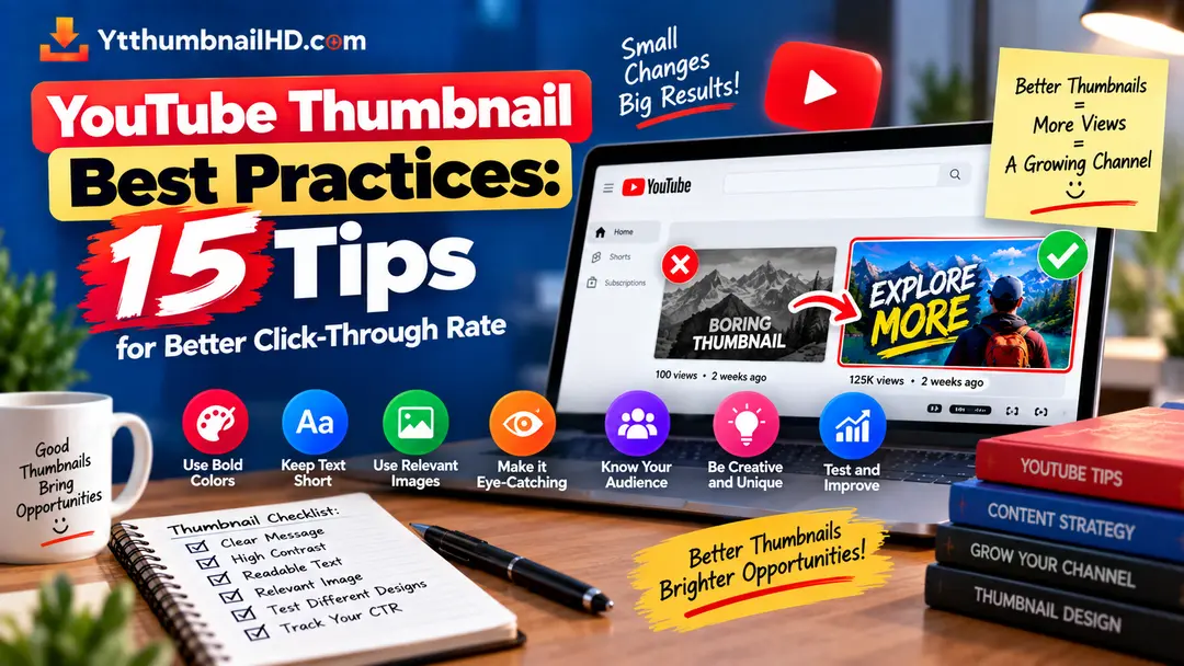
A YouTube thumbnail has a difficult job. It has to compete with dozens of other images while giving viewers a quick idea of what your video is about.
That does not mean every thumbnail needs huge text, bright colors, shocked faces, or lots of arrows. In fact, adding more elements can sometimes make a thumbnail harder to understand.
The better approach is to build a thumbnail around a clear idea and then make a series of small decisions that improve readability, relevance, and visual appeal.
Below are 15 practical YouTube thumbnail best practices that you can use before publishing a new video or when reviewing an older thumbnail.
Design for Your Audience
There is no universal thumbnail style that works equally well for every YouTube channel.
A gaming audience may respond to a completely different visual style than someone watching cooking tutorials, software guides, product reviews, or educational videos.
Before designing your thumbnail, think about the person who is most likely to watch the video. What would immediately make sense to them?
Make One Element the Star
A thumbnail should have a visual hierarchy. Something should naturally attract attention before everything else.
This could be a person, product, object, result, screenshot, location, or another important part of the story.
If every element has the same size and visual weight, the viewer has no obvious starting point.
Use Text Only When It Helps
Thumbnail text is useful when it adds context that the image alone cannot communicate.
It becomes less useful when it simply repeats information that is already obvious from the title or image.
Before adding text, ask yourself whether the thumbnail would still communicate the main idea without it.
If the answer is yes, you may only need a short supporting phrase rather than a complete sentence.
Make Text Easy to Read
Even useful text becomes a problem if viewers have to stop and work out what it says.
Use a font that remains readable at smaller sizes. Give the text enough space and avoid placing important words over a complicated part of the image.
- Use clear letter shapes.
- Avoid overly decorative fonts.
- Give text enough contrast from the background.
- Keep important words away from busy areas.
- Do not squeeze too many words into a small area.
Use Strong Visual Contrast
Contrast is one of the simplest ways to make important elements easier to notice.
You can create contrast through brightness, color, size, positioning, or separation from the background.
For example, a light subject can stand out against a darker background, while a dark headline can work well on a light area.
Show the Result When Possible
When a video is about achieving a result, showing that result can make the thumbnail easier to understand.
For example, a tutorial about changing a website could show the finished page. A cleaning video could show the difference between before and after. A cooking video could show the finished dish.
The important part is that the result should actually belong to the video. Do not create a fake result simply because it looks more impressive.
Keep the Thumbnail Relevant
A thumbnail should set an expectation that the video can actually satisfy.
If a viewer clicks because of an image that has little or nothing to do with the video, the packaging may attract the click but create disappointment afterward.
Relevance matters more than trying to create the biggest possible reaction.
Do Not Copy the Title Word for Word
Your title and thumbnail are two parts of the same package. They do not need to say exactly the same thing.
A better approach is to let them complement each other.
The image creates a quick visual idea while the title gives the viewer more specific context.
Avoid Visual Clutter
Adding more elements does not automatically make a thumbnail more interesting.
Too many arrows, badges, logos, screenshots, text blocks, icons, outlines, and effects can make the design difficult to understand.
After finishing the design, remove one or two elements and look at it again. If the message becomes clearer, those elements were probably not necessary.
Build a Recognizable Style
Consistency can help viewers recognize your content when they see it again.
This does not mean every thumbnail should be identical. Instead, you can repeat a few brand elements such as a familiar color treatment, typography style, composition pattern, or small logo.
Keep enough flexibility for the thumbnail to fit the actual video topic. A consistent brand style should support the content rather than making every thumbnail look like a copy of the previous one.
Check How It Looks Small
Designers usually work with a large version of the image. Viewers often see the finished thumbnail much smaller.
That difference can expose problems that are difficult to notice while designing.
Create More Than One Version
Sometimes the first thumbnail idea is not the strongest one. Creating a few different concepts before choosing the final design can help you avoid settling too early.
The variations do not have to be completely different. You might change the main subject position, background, text treatment, or visual emphasis.
If your channel has access to YouTube's Test & Compare feature, you can use different thumbnail options to test how viewers respond. YouTube currently evaluates the result using watch time share rather than simply choosing the thumbnail with the highest CTR.
Do Not Judge CTR Too Quickly
One of the easiest mistakes is checking a new video's CTR shortly after publishing and immediately deciding that the thumbnail is either amazing or terrible.
Early numbers can move around significantly. Your video may initially be shown to a smaller or more familiar audience before reaching a broader group of viewers.
Give the video enough data to understand what is happening before making major conclusions.
Compare Performance by Traffic Source
A thumbnail may perform differently depending on where viewers encounter it.
Someone searching for a specific answer may have a very different reason to click than someone casually browsing the YouTube homepage.
That is why CTR should be considered alongside impressions and traffic source rather than treated as a universal score.
Never Sacrifice Accuracy for a Click
This may be the most important rule on the list.
A misleading thumbnail can sometimes produce an attractive initial click, but the viewer may quickly realize that the video does not match what they expected.
The goal is not simply to get someone to click. The goal is to make the right viewer interested enough to click and then find that the video delivers what the thumbnail and title promised.
YouTube specifically advises creators to avoid misleading, deceptive, or clickbait titles and thumbnails.
Give viewers a reason to click without giving them a false reason.
15-Point Thumbnail Checklist
Run through this list before uploading your next video.
Need to Download a YouTube Thumbnail?
If you want to save the thumbnail from an existing YouTube video, use YTThumbnailHD to find and download the highest available thumbnail quality supported by the video.
Download YouTube ThumbnailFrequently Asked Questions
Make the main idea easy to understand. A thumbnail should quickly communicate what makes the video relevant or interesting without becoming confusing or misleading.
Text can be useful when it adds information that the image cannot communicate on its own. It is not necessary for every thumbnail, and too much text can make a design difficult to understand.
Not by itself. CTR should be considered together with impressions, traffic sources, watch time, and other performance signals. A higher CTR from a very small or highly specific audience does not automatically mean the thumbnail will perform the same way with a broader audience.
No. A thumbnail should create interest while accurately representing the video. Misleading packaging can attract clicks that do not result in a satisfying viewing experience.
No. A consistent visual identity can help viewers recognize your content, but each thumbnail should still be designed around the specific video. Repeating exactly the same layout can make your thumbnails look predictable.
There is no single waiting period that works for every video. The important thing is to avoid making conclusions from very little data. Give the video enough impressions to establish a useful pattern and consider where those impressions came from.