How to Make a YouTube Thumbnail That Gets More Clicks
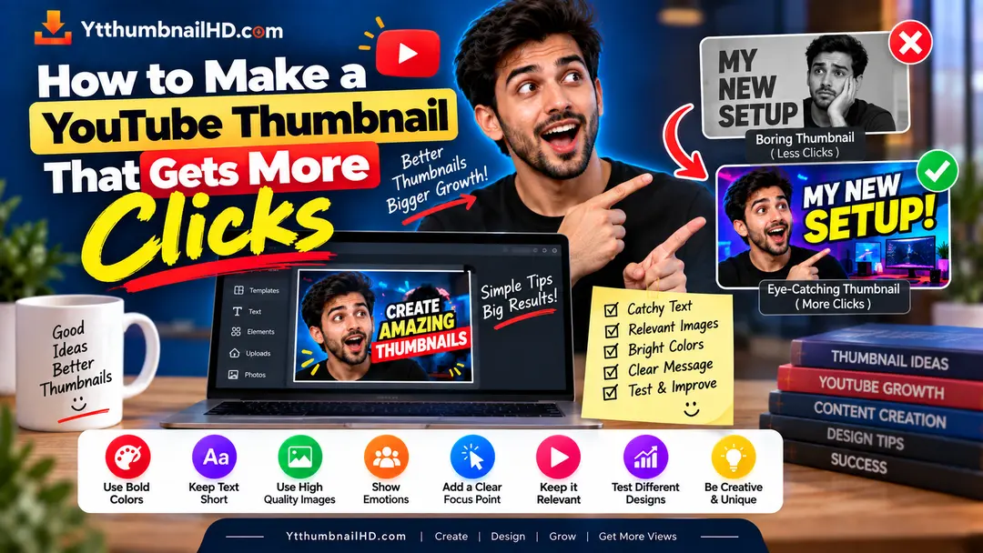
A good YouTube thumbnail does not need to be complicated. In many cases, the thumbnails that work best are the ones that communicate one clear idea almost instantly.
The real challenge is not adding more text, colors, arrows, or effects. It is deciding what deserves attention and what should be left out.
In this guide, we will break down how to create a thumbnail that makes people understand your video's idea quickly, creates enough curiosity to earn a click, and still accurately represents what they will find after opening the video.
1. Start With One Clear Idea
One of the easiest ways to make a thumbnail confusing is trying to explain the entire video inside the image.
Your thumbnail does not have to tell the whole story. It only needs to communicate enough information to make the viewer understand what the video is about and become interested in seeing the rest.
Before designing anything, finish this sentence:
"What is the one thing I want people to notice?"
For example, if your video is about fixing a slow laptop, the main visual could be the laptop with a clear performance problem. You do not need to add ten different screenshots, icons, arrows, and paragraphs of text.
A focused thumbnail is easier to understand than a crowded one because the viewer does not have to figure out where to look first.
2. Choose a Strong Main Visual
Your main image is usually the first element that attracts attention. That makes image selection more important than decorative effects.
Choose a visual that directly relates to the video's subject. It could be a product, person, result, before-and-after comparison, location, object, or a specific moment from the video.
It should make sense with the video topic.
Viewers should understand it without studying tiny details.
Avoid images that become muddy or unclear when displayed at a small size.
3. Keep Thumbnail Text Short
Text can help explain the idea, but too much text turns a thumbnail into a tiny poster.
Instead of copying the video title onto the thumbnail, think about what information can be communicated visually and what short phrase could add something extra.
HOW TO MAKE A YOUTUBE THUMBNAIL THAT GETS MORE CLICKS AND VIEWS
GET MORE CLICKS
The second approach leaves more room for the visual to do its job. The exact wording will depend on your video, but the principle is simple: remove words that do not add anything useful.
4. Create Enough Contrast
A thumbnail can have great photography and still fail visually if everything blends together.
Contrast helps separate the important elements from the background. You can create contrast through brightness, color, size, position, or even a simple background blur.
For example, dark text on a dark background is difficult to read. Similarly, a small subject placed over a busy background can disappear.
5. Use Faces and Emotions Carefully
Faces can be powerful thumbnail elements because people naturally notice facial expressions. But adding a face to every thumbnail is not automatically a good strategy.
The expression should match the story of the video. A surprised expression can make sense for a surprising result. A focused expression might work better for a tutorial or technical video.
If the video does not involve a person, there is no reason to force one into the design. A product, result, comparison, or other strong visual may communicate the idea much better.
6. Create Curiosity Without Clickbait
There is a useful difference between curiosity and clickbait.
Curiosity gives viewers a reason to want the answer. Clickbait makes a promise that the video does not actually deliver.
Show an unusual result and let the video explain how it happened.
Show something that never happens in the actual video just to attract a click.
YouTube specifically recommends that titles and thumbnails accurately represent the content. Misleading packaging can attract an initial click but create a poor viewing experience.
7. Make the Thumbnail and Title Work Together
Your thumbnail and title should not compete with each other. They should form one clear message.
A simple way to approach this is to give each one a slightly different job.
GET MORE CLICKS
Short visual message that creates interest.
How to Make a YouTube Thumbnail That Gets More Clicks
Gives the viewer the specific context.
YouTube also recommends keeping titles accurate and concise, with the most important words toward the beginning because viewers may not see the entire title everywhere.
8. Remove Anything That Does Not Help
This is one of the most useful steps in thumbnail design, and it is often skipped.
After finishing your design, look at every element and ask: does this help the viewer understand the video or become interested in it?
If the answer is no, remove it.
- Remove decorative arrows that point nowhere.
- Remove repeated words.
- Remove unnecessary logos.
- Remove tiny details nobody can read.
- Remove extra colors that make the design noisy.
- Remove effects that make the main subject harder to see.
Good thumbnail design is often as much about editing as it is about adding.
9. Check the Thumbnail at Small Size
A thumbnail may look fantastic while you are designing it at full size and become almost impossible to understand when it is displayed much smaller.
This is why you should always check the final design at a reduced size before publishing it.
View it at a much smaller size than your original working canvas.
Then look back and notice what catches your eye first.
If the text becomes difficult to read, simplify it.
YouTube notes that thumbnails appear differently across devices, so making the important visual information easy to see at different sizes is important.
10. Common YouTube Thumbnail Mistakes
You do not need to become a professional graphic designer to make better thumbnails. Avoiding a few common problems can already make a noticeable difference.
Too much text
The viewer needs to read a paragraph before understanding the thumbnail.
No visual focus
Everything is the same size, so nothing gets attention first.
Low contrast
Text and important objects blend into the background.
Overusing effects
Shadows, glows, arrows and outlines are used everywhere without a clear purpose.
Misleading imagery
The thumbnail promises something the video does not actually deliver.
11. A Simple Thumbnail Workflow
You can make the whole process much easier by following the same basic workflow every time.
Understand the video
Identify the main idea, audience, and promise of the video.
Choose the hero visual
Select the one image or subject that should get the most attention.
Add only useful text
Use a short phrase only when it adds information that the image cannot communicate alone.
Improve contrast
Make sure the subject and text clearly separate from the background.
Remove clutter
Delete anything that does not contribute to the main message.
Test the final view
Shrink the thumbnail and check whether the main idea is still obvious.
30-Second Thumbnail Checklist
Need a YouTube Thumbnail Image?
If you need to download the thumbnail from an existing YouTube video, you can use YTThumbnailHD to get the highest available thumbnail quality supported by the video.
Download YouTube ThumbnailFrequently Asked Questions
A clickable thumbnail usually communicates a clear idea, has a strong visual focus, uses readable elements, and gives viewers a reason to be interested in the video. There is no single design that works for every audience.
Not necessarily. A thumbnail can use a short phrase that complements the title instead of repeating it word for word. This gives the image and title a chance to communicate more information together.
No. Faces can work well when the expression supports the video's idea, but they are not required. Products, objects, screenshots, locations, results, and other strong visuals can also make effective thumbnails.
It can, but complexity by itself does not make a thumbnail better. If extra elements make the main idea harder to understand, simplifying the design may be a better choice.
If an older video is underperforming, testing a different thumbnail can be worth considering. YouTube also recommends experimenting with older thumbnails when you want to improve their appeal.
Not by itself. YouTube recommends looking at CTR together with impressions, traffic sources, and viewer behavior. CTR can also change as a video reaches a broader audience.